Finding the right apartment can be one of the most daunting aspects of living in New York City. And there are few things New Yorkers cherish more than the tiny space they call home. Although NYC is one of the priciest cities to live in, it certainly doesn’t lack options. For this week’s project I’ll turn my attention to a Kaggle competition where I’ll be predicting the popularity of various NYC rental apartments based on listing information found on Renthop.com.
 Figure 1 - Apartment image from sample listing on Renthop.com.
This post gives an outline of my approach to solving the Two Sigma Connect: Rental Listing Inquiries Kaggle competition. The competition was as rewarding as it was challenging. It featured a very diverse dataset (including geospatial, image, text, and temporal data) and was co-sponsored by Two Sigma Investments and Renthop.com. The goal of the competition was to answer the question: “How much interest will a new rental listing on RentHop receive?” The problem was a multi-class one where we were tasked with predicting the associated probabilities of an apartment listing receiving “low”, “medium” or “high” levels of interest. Submissions were evaluated using a multi-class logarithmic loss metric.
My final model consisted of an ensemble of gradient boosting (XGBoost), extremely randomized trees (ExtraTrees) and a two-level feedforward stacked metamodel (StackNet) that featured a wide variety of base learners. In the end, I placed 214 out of 2,489 competitors (top 9%). You can find the final leaderboard here.
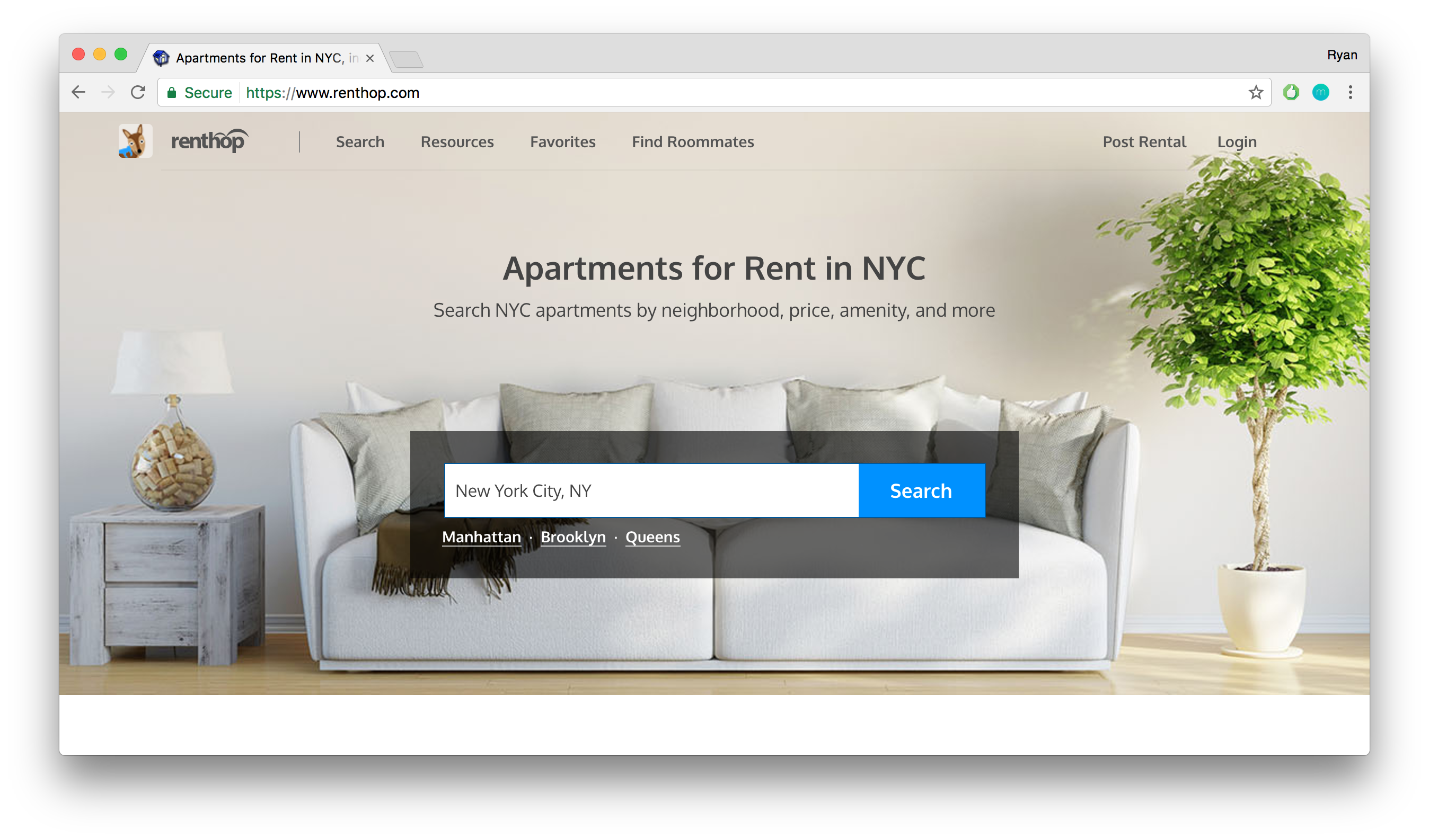 Figure 2 - Screenshot of Renthop.com homepage.
About the Data
The target variable, interest_level, consisted of three categories: low, medium, and high. Interest was defined as the number of inquiries a listing received for the duration that the listing was live on the site. There were also 14 original input features: bathrooms, bedrooms, building_id, created, description, display_address, features, latitude, listing_id, longitude, manager_id, photos, price, and street_address. Below is a depiction of the original input features.
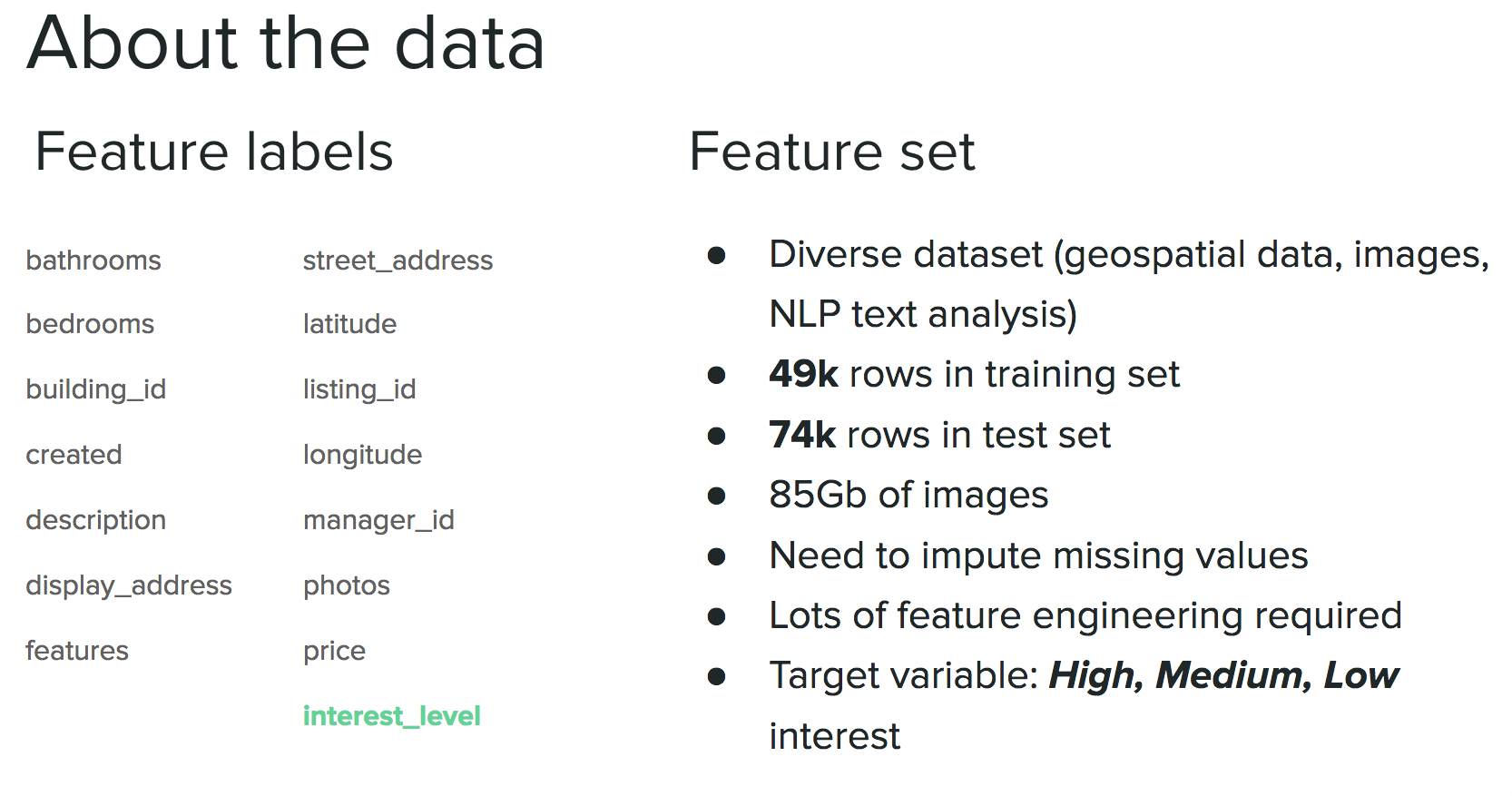 Figure 3 - A brief introduction to the raw dataset, including feature and target labels.
The training dataset (49k rows) was highly imbalanced with 69% “high”, 23% “medium”, and 8% “low” interest. The data spans April - June 2016 and was provided by Renthop.com. Below is a geospatial mapping of apartment interest levels across NYC.
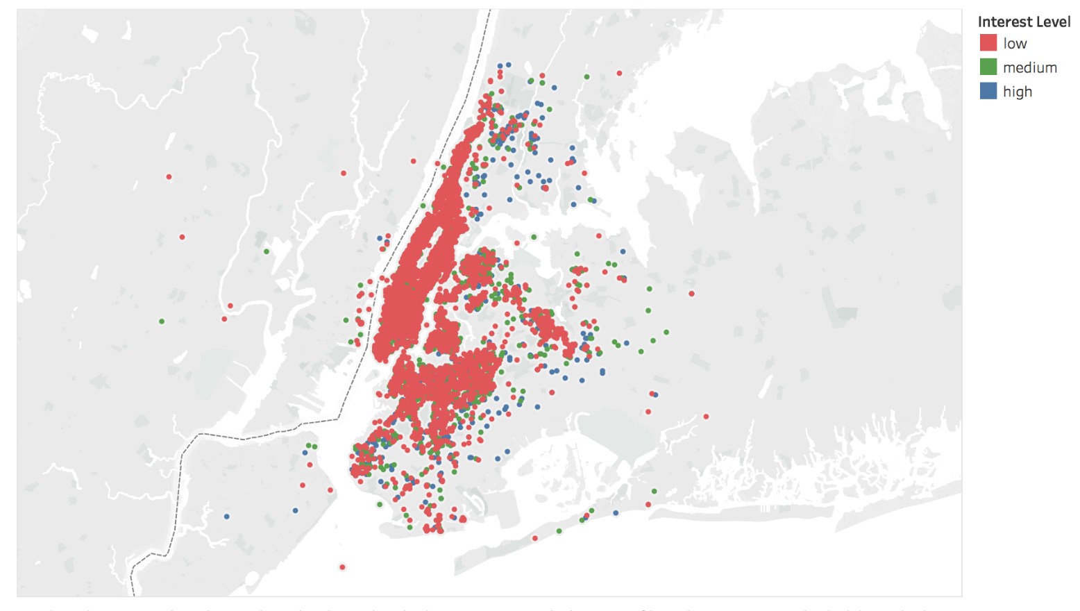 Figure 4 - A geospatial mapping of Renthop.com apartment popularity across NYC.
Feature Engineering
Because of the diversity of the dataset I thought feature engineering was going to be the key to differentiating my submissions. My thinking was something along the lines of: there are only a finite number of models in a data scientist’s toolbox, so the best way to achieve better performance is to input better data (aka spend a lot of time feature engineering). More than half my time was spent feature engineering, in essence trying to tease out additional insights from the data that would hopefully add predictive power to my models. The other half of my time was divided between the exploratory data analysis and the model selection/tuning phases.
Below is an overview of some of the feature engineering techniques I used along with a brief discussion of their relative feature importance:
 Figure 5 - Overview of feature engineering applied to independent variables.
- Geospatial density: For every apartment listing I calculated the number of other apartment listings within a 5 block radius. My intuition was that denser areas will have more competition and thus lower overall interest. This was mostly true, but the feature importance wasn’t as good as I hoped it would be.
- Distance to city center: I calculated the distance of each apartment to the center coordinates of NYC, which ended up being somewhere inside Central Park. This feature was useful for the same reason as the geospatial density: the farther you get from the center of the city the fewer apartment options you have. The reduction in apartment options typically results in higher interest per apartment (i.e., the supply is lowered more than the demand, which thus drives interest higher). This feature had moderate feature importance.
- Neighborhood clustering: I used unsupervised clustering (KMeans) to create 40 different neighborhoods across NYC. I clustered solely on latitude and longitude and it worked fairly well actually. Using this I could compare apartment prices to the median apartment price for each neighborhood. These were in the top 15% of feature importance. Prior attempts to use the Google API resulted in me getting kicked off (too many API calls in a single day) and I found that the Python Reverse Geocoder package was not accurate enough to discern neighborhood information within NYC. See below for the KMeans clustering that was used as a proxy for neighborhood. Spurious geospatial coordinates (e.g. latitude/longitude = 0) were imputed by calling the Google API with the street address and then using the latitude and longitude outputs to reclassify the geo-coordinates. I constrained all remaining outliers to be within the 1st and 99th latitude/longitude percentiles, which essentially formed a rectangular box around NYC.
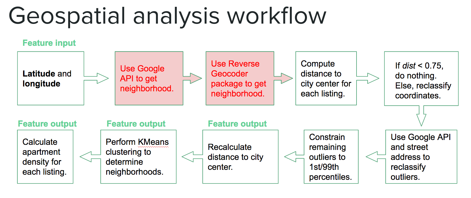 Figure 6 - Geospatial analysis workflow including imputation of spurious latitude/longitude values and outlier removals.
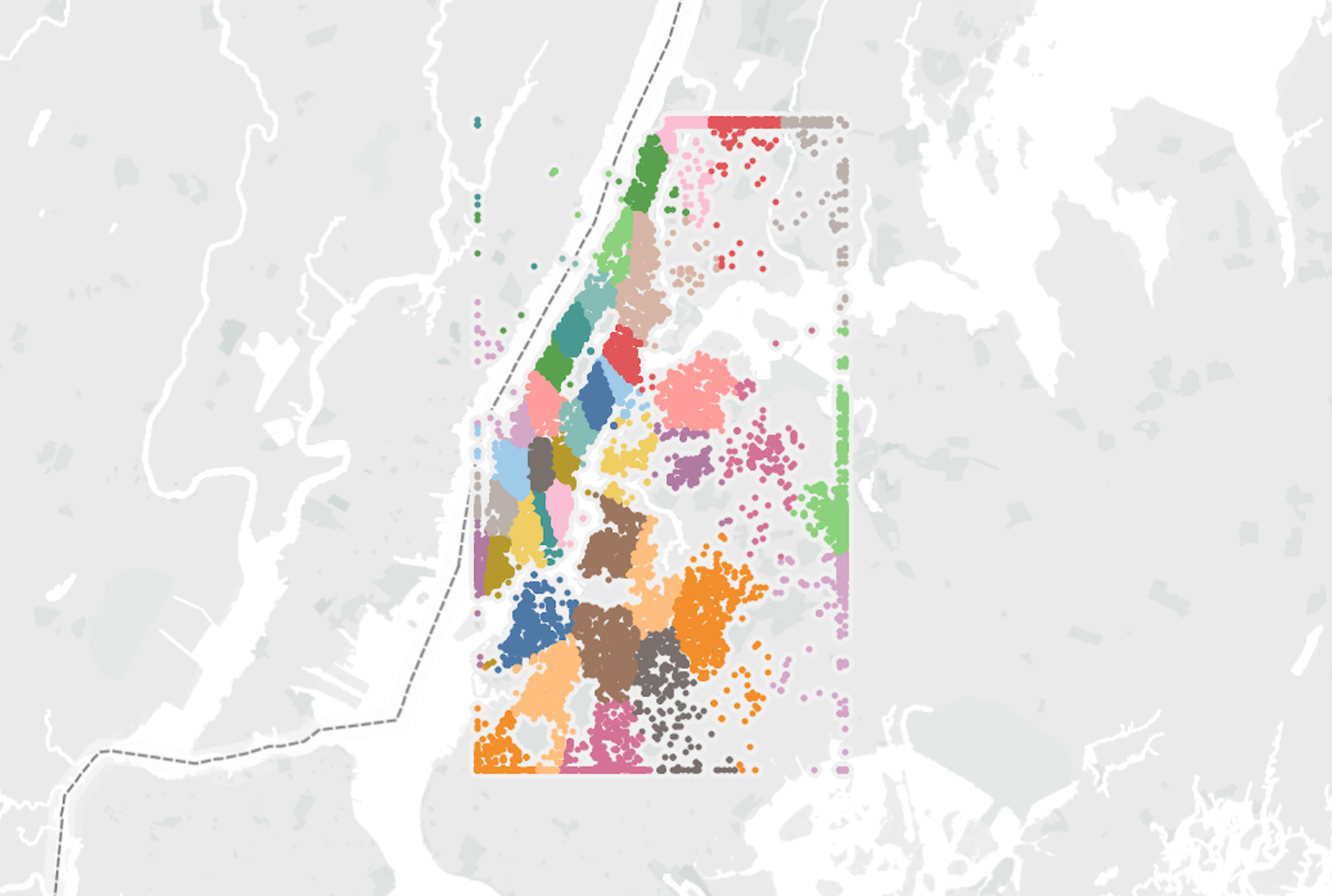 Figure 7 - KMeans clustering (K=40) was used as a proxy for representing NYC neighborhoods.
- Datetime objects: I broke the created column down into smaller, more relevant time objects such as week, day of week, month, hour, etc. Minutes and year were dropped as they added no value.
- Normalized parts of speech: I looked at 18 different parts of speech (e.g., nouns, adverbs, conjuctions, etc.) on the description column and then normalized these by the total number of description words per row. Many of these were surprisingly high on my feature importance ranking, but adding them actually lowered my overall score. Perhaps this meant these features were highly correlated with other features. Anyway, I didn’t explore that, I just dropped them and moved on. These were not included in my final model.
- Sentiment analysis: I calculated the negative, neutral, positive and compound sentiment analysis scores for each row in the description column. These gave decent feature importance, but not as high as I hoped for.
- Tf-idf analysis: I performed term frequency-inverse document frequency analysis on the description column to collect the most popular 100 words (using a minimum usage threshold of 20 and English stopping words).
- Word counts: This was a simple feature that I applied to both the description and features columns. The number of words in the apartment description column as well as the number of features an apartment had were actually pretty good indicators of people’s interest in a rental apartment.
- Spam filter: As part of an attempt to filter out bogus or spammy entries I implemented a spam filter that calculated the percentage of words in the description that were captitalized as well as a counter that tracked the number of exclamation points found in the description. These features had average feature importance.
- Homemade dictionaries: After doing CountVectorizer on the features column to obtain the 200 most popular words, I used a homemade dictionary to try to group similar words/phrases (e.g., “doorman” and “door man”). I also created a dictionary of luxury words that were meant to flag luxury apartments. Both dictionaries made my score worse, so I dropped them.
- Street-display address similarities: I calculated similarity scores between the street address and display address. What I found was interesting: the more dissimilar the addresses were the more likely they would received “high” interest.
- Flagging street directions and type: I created flags for “East”,”West”,”North” and “South” directions as well as “Street” and “Avenue” from the street address column. These flags added very little value to the model.
- Flagging “bad” photos: I noticed each photo link had the listing_id in it. However, several (maybe 500 or so) of the photos actually referenced different listings, which means the photos were pointing to the wrong apartment. This ranked poorly in feature importance because of the relatively rare occurrences of “bad” photos.
- Flagging “weird” prices: I defined “weird” prices as anything that didn’t end in a 0, 5 or 9. My intuition here was that people may be turned off to an apartment if the monthly rent is somewhat random, for example, $2171 as opposed to $2100. This feature ended up having basically no importance to the model.
- “Price per” features: Features derived from the price (e.g., price per bedroom, price to median price of a neighborhood, etc.) really moved the needle in terms of improving model performance. The trick was using the price feature to create valuable insights. For example, if we calculate the ratio of the price of an apartment to the median price of all other apartments in the building we can create a sense of whether or not that particular listing is a “good deal”. We can also use the ratio of price to number of bedrooms or bathrooms as a proxy for estimating the price per square foot of the apartment.
- Photo metadata: I extracted simple features from the metadata of the photos, such as file size, type, pixel sizes, etc. I also looked at the number of photos per listing and, surprisingly, found that more images often led to lower interest levels (perhaps more images reveal more apartment flaws?). The most important feature from the photo metadata was shared by KazAnova in the Kaggle forums, where he revealed that by extracting the timestamp of the folders containing all of the apartment images one could achieve significant gains on the leaderboard.
- Manager and building “skill”: These features are credited to gdy5, which I discovered in the Kaggle forums. The premise behind the feature is to essentially use Bayesian statistics to calculate a posterior probability (probability of interest_level given manager_id or building_id) with information about the target variable. This led to significant gains in the performance of my models and was perhaps the single greatest boost I received from any engineered feature. These variables were of the highest feature importance.
In the final analysis I was able to transform the original 14 features into 300+ new features that I input into my models.
Model Selection
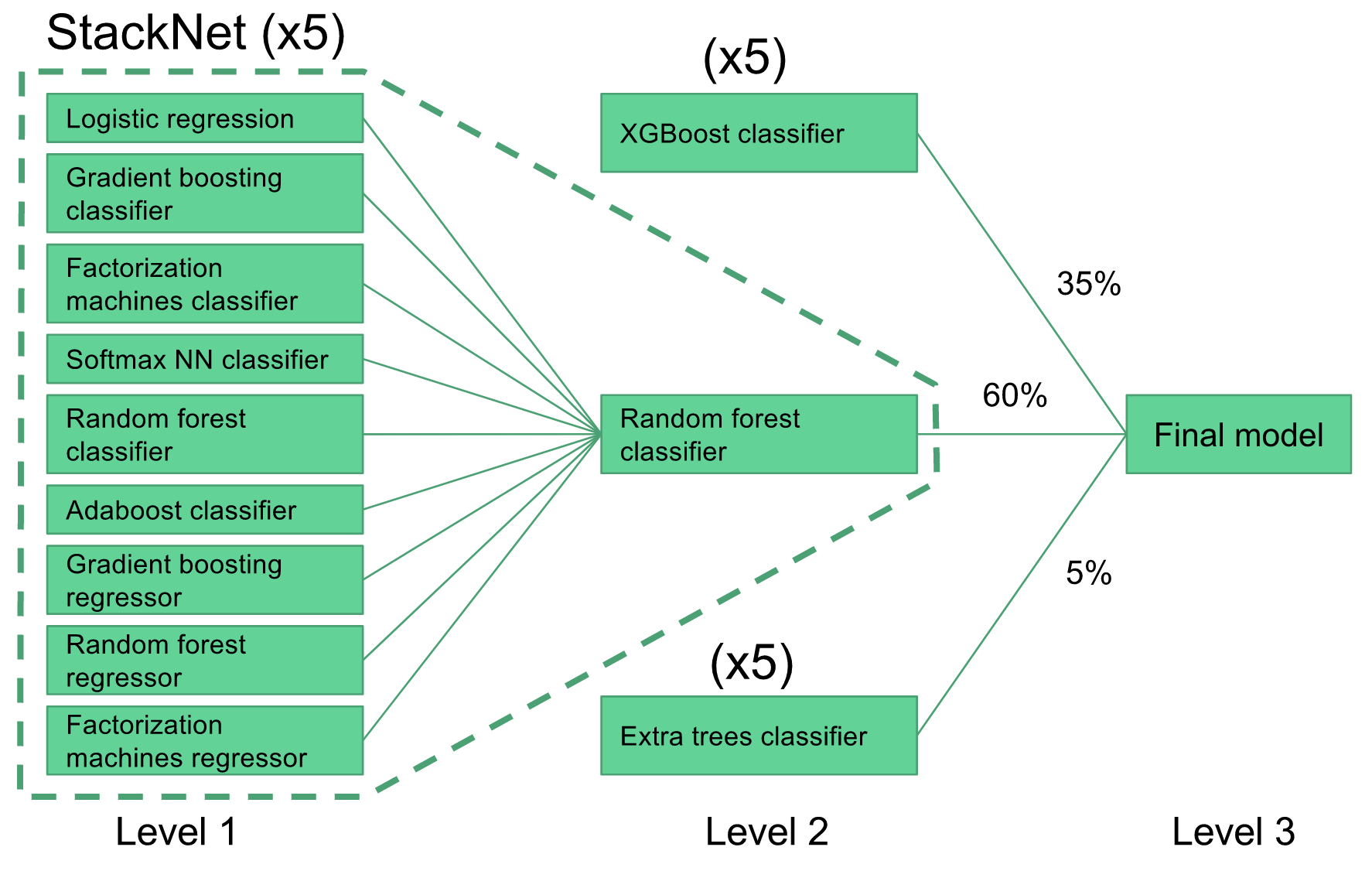 Figure 8 - Graphical depiction of stacked and ensembled final model.
To get up and running I started with a random forest classifier model. I used that model to get general information about which features were important and which were seemingly just adding noise. From there I created gradient boosting model using XGBoost (at this point I learned that some features that worsened the RF logloss score actually ended up improving the XGBoost logloss score). My XGBoost model was my single best performing model and it gave a logloss score in the range 0.520-0.521. Averaging five XGBoost models (to reduce the variance) lowered my XGBoost logloss score to around 0.519. I was stuck at around 0.520 for a while, and then I came across a metamodeling framework called StackNet. StackNet is a feedforward metamodeling framework based on the method of stack generalization and was developed in Java by Marios Michailidis (aka KazAnova), who is currently a PhD student at UCL pursuing research in machine learning. This metamodeling framework demonstrated to me firsthand the power of model ensembling.
The StackNet model I implemented included a diverse set of 9 different Level 1 base learners (e.g., neural network, logistic regression, gradient boosting, factorization machines, etc.) and a single Level 2 random forest model. The outputs of the Level 1 models served as inputs to the Level 2 model, and each model only predicted the target variable (no backward propagation). I experimented with other stack configurations, such as having a neural network or gradient boosting model as the Level 2 model or even adding a Level 3 model, but all attempts were overfitting the data and led to a worse logloss score. My StackNet model was able to achieve a logloss score of 0.514. Weighted averaging the XGBoost model, StackNet model and a third ExtraTrees model led to a logloss score around 0.511. Each of the Level 2 models were run five times and averaged in order to reduce the variance. The final Level 3 model was comprised of weighted averages of each of the Level 2 models. The exact weights were pretty much determined by trial and error through several submissions to the Kaggle leaderboard (aka gaming the system). I used 5-fold cross-validation on all my models (including StackNet) to guard against overfitting.
Conclusions
There will always be things I could have done better. For this project the big elephant in the room was the 85Gb of images. If I had more time I would have liked to perform deep feature extraction on the images. It would also have been nice to develop a flag that could detect whether the image was showing a floorplan or an actual picture of the apartment, or a flag to detect whether or not the image had a watermark (possibly signifying a higher end apartment listing). Perhaps converting the image data into frequency space and looking at the frequency components would have been useful (e.g., do higher frequencies indicate clutter?). Or even looking at the image brightness and contrast I believe would have led to slight bumps in model performance.
After reflecting on the competition, here are the four key takeaway points I came up with for this project:
- Reasonable predictions of NYC rental property interest were achieved
- Feature engineering was crucial to improving model performance
- Feature selection/tuning with RF does not always translate to other models
- Stack generalization works well (so does XGBoost) and is necessary to achieve success in Kaggle competitions
Lastly, here’s a glimpse of the final leaderboard.
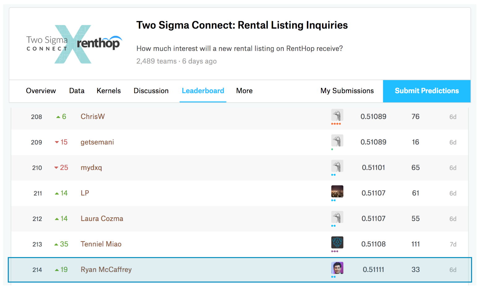 Figure 9 - Snapshot of Kaggle final leaderboard.